
For Healthcare
Designed for versatility, this logo seamlessly integrates across hospital signage, appointment booking platforms, business cards, digital assets, and medical kits. Its structured design ensures a professional yet approachable identity, making it instantly recognizable in the healthcare industry.

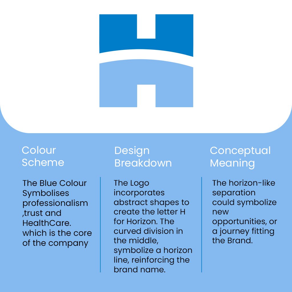
This design encapsulates the essence of trust, innovation, and patient-centered care, positioning Horizon as a dependable name in medical and healthcare services.
Brand Identity
The Horizon logo represents trust, care, and innovation in the medical field. With a clean and structured design, it reflects the brand’s commitment to delivering high-quality healthcare services while ensuring a sense of reliability and professionalism.
Color Palette :
The color scheme features a blend of calming and trustworthy hues, such as shades of blue and white, which symbolize cleanliness, safety, and reliability—essential values in the healthcare industry.
